Expand Menu
Merrill Bank of America Financial Advisor Pages & Dashboard
Help Merrill's advisors market their services to prospects through landing pages and enhance platform solution that enables advisors to efficiently spin up new team site.
My Role
Lead Designer
Timeline
2022 - Present
Project Cover of Merrill Bank of America Financial Advisor Pages & Dashboard
Overview
Financial Advisor Pages

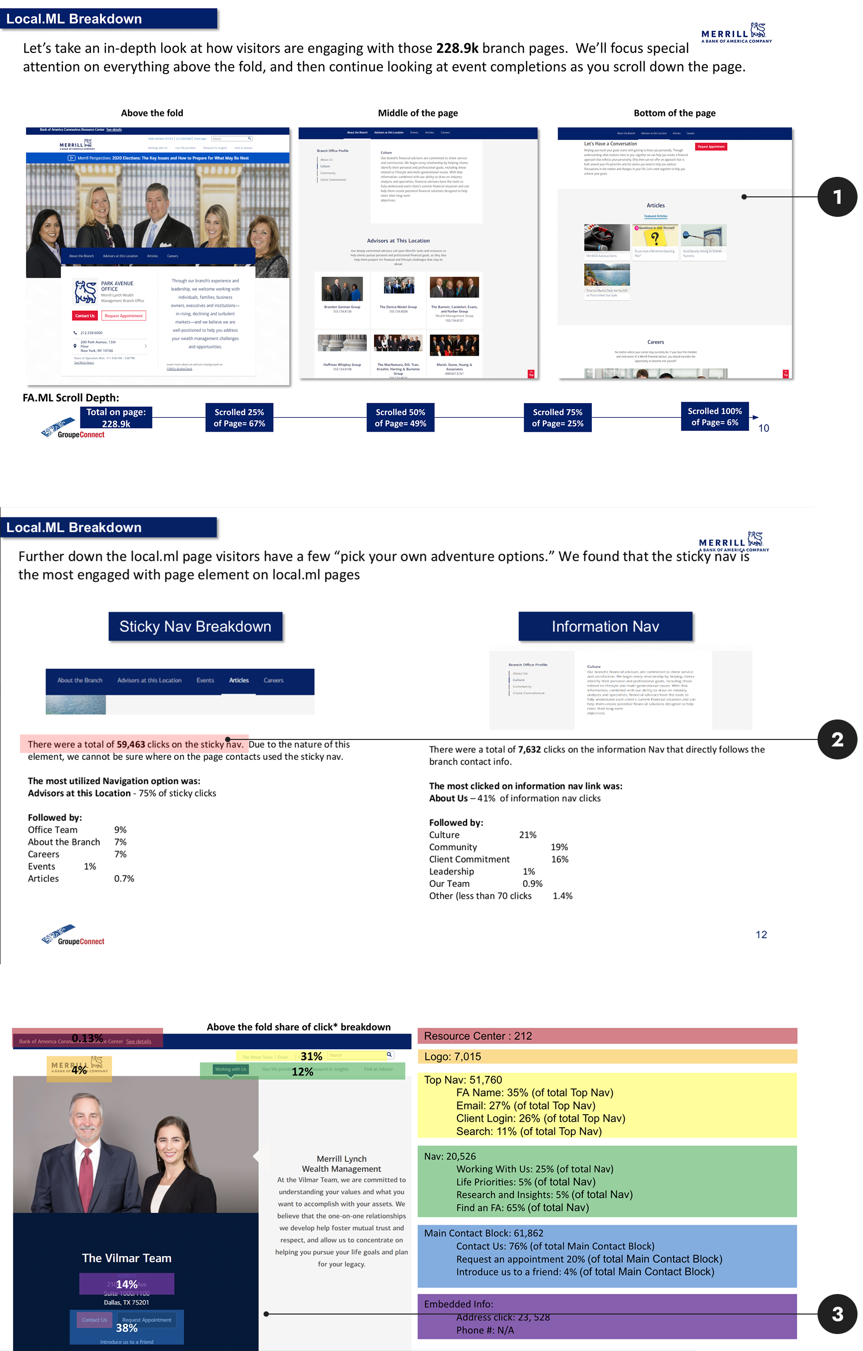
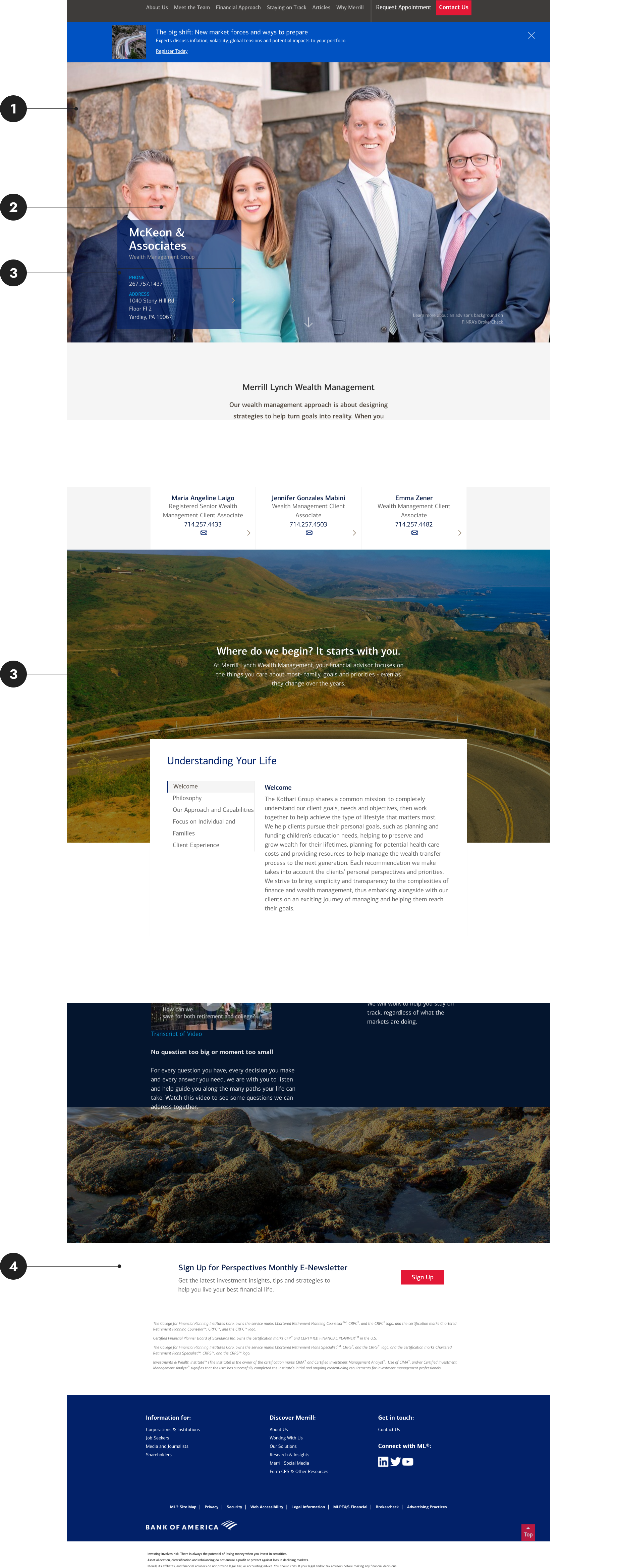
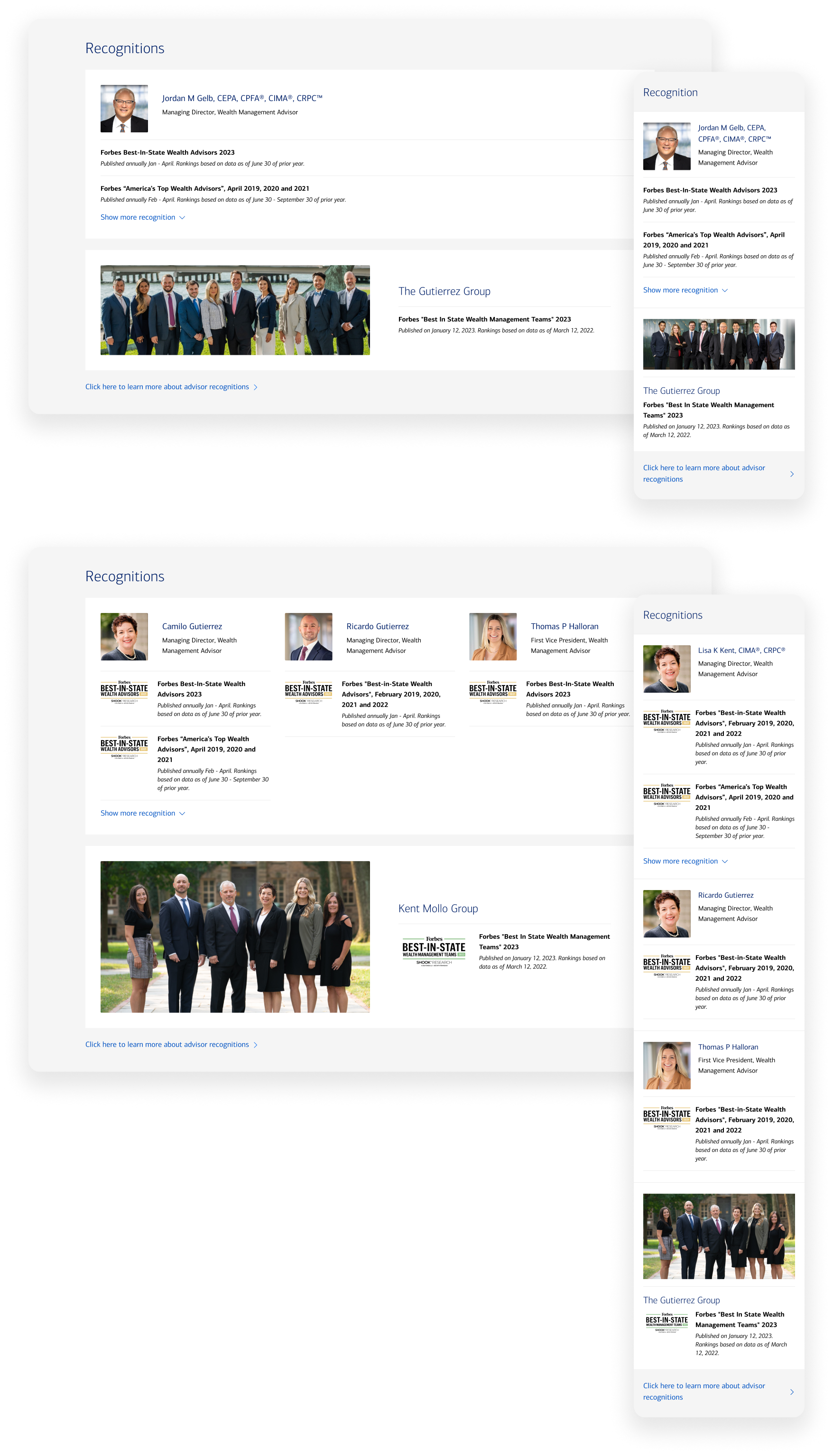
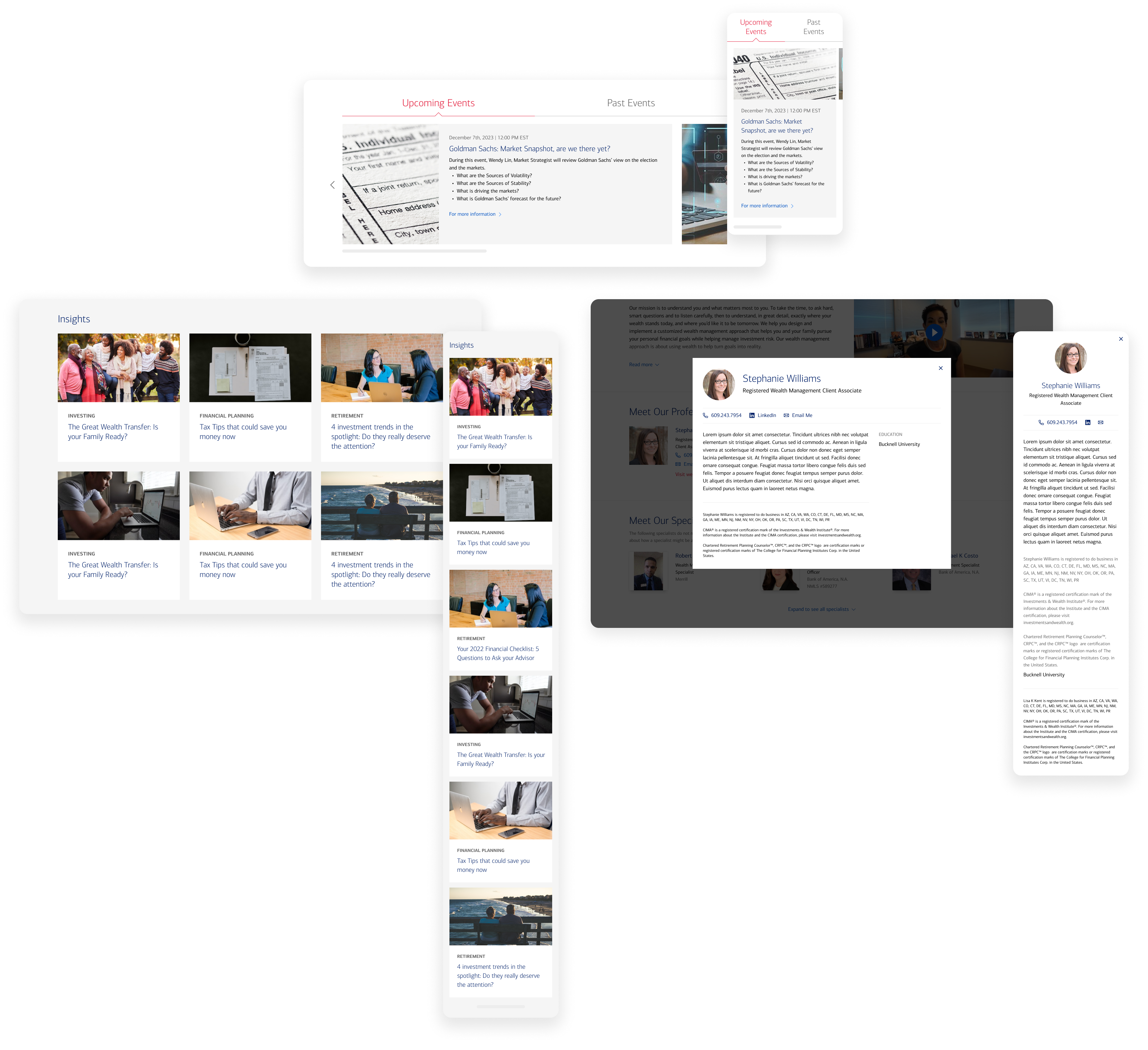
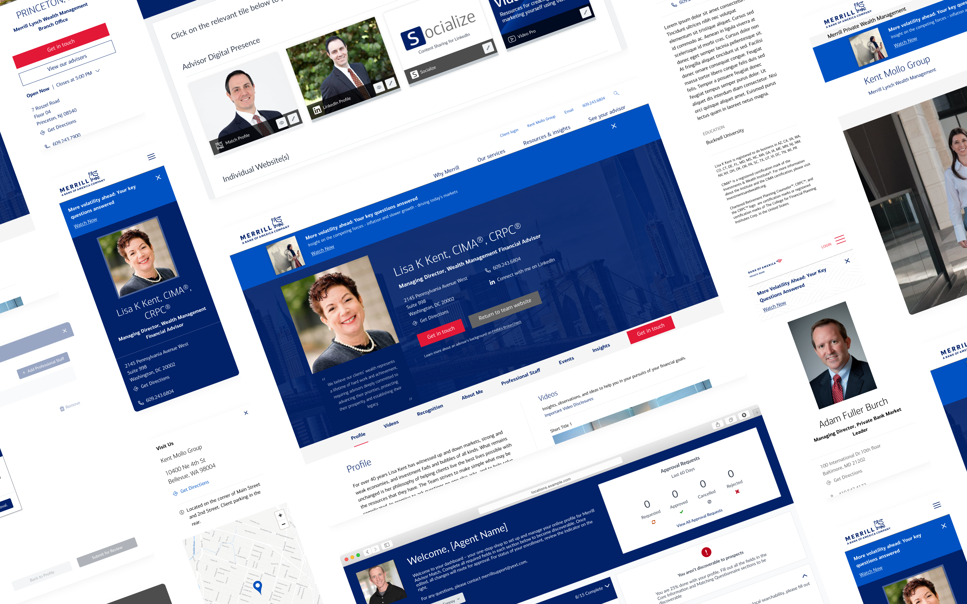
Merrill leverages the Yext platform to efficiently manage thousands of financial advisor listings and web pages.

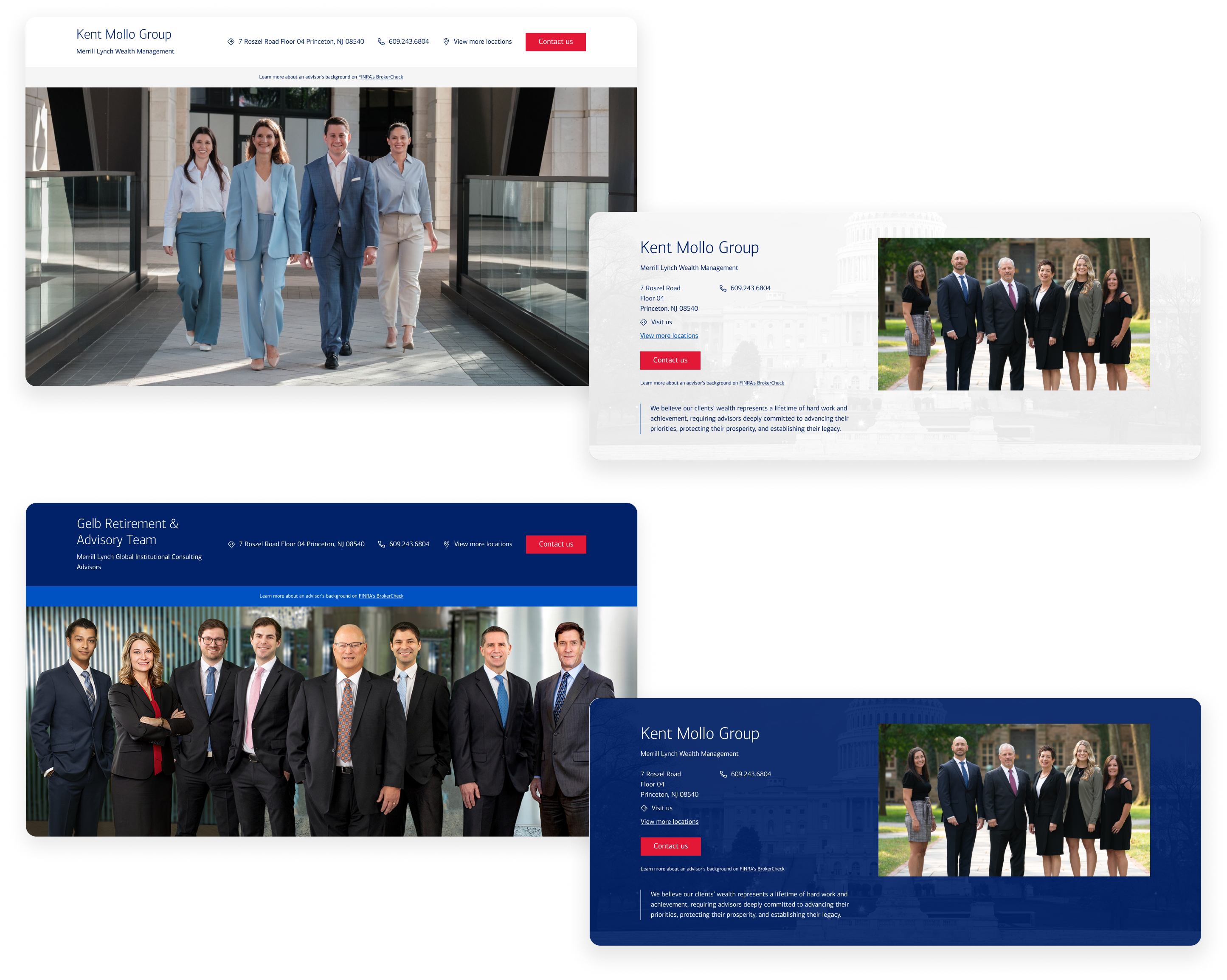
  • There are three distinct lines of business. Each required tailored branding and specifications.
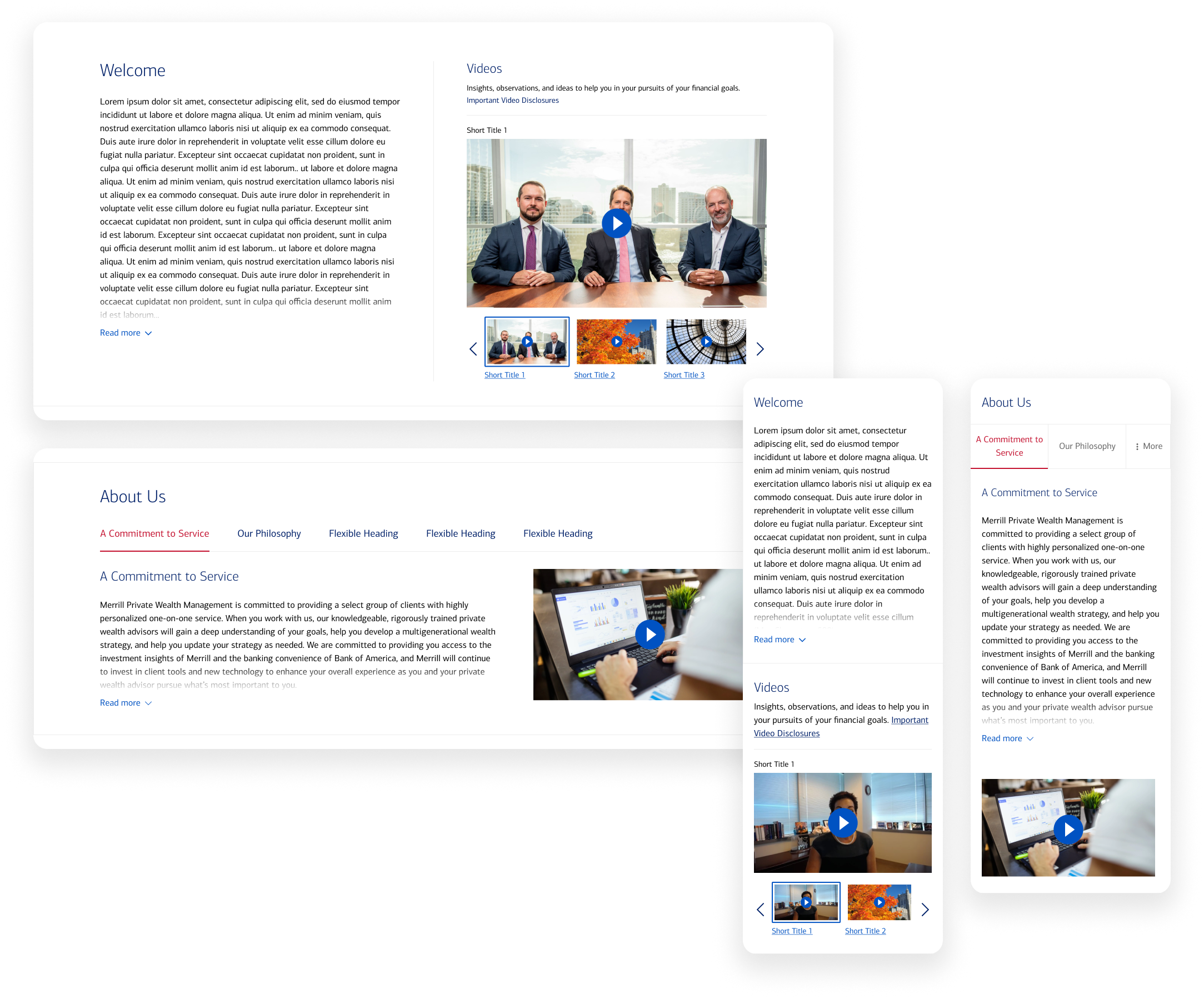
  • We had developed a content management dashboard and was looking to build a set of landing page templates for advisor and advisor teams
  • This solution will showcase each advisor’s financial services while empowering them to effortlessly manage their website content.
Image of existing Merrill's digital products
Overview
Who are the users?
Icon of prospective customer
Prospective Customers

Who are browsing the sites for a perspective advisors or contacting their existing advisors.

  • Looking for a trustworthy advisor to handle their assets
  • Learning more about how an advisor or team can support their financial goals
Icon of advisor
Advisors

Who want to market themselves to prospective customers by managing the content on their personal or team sites.

  • Showcasing their services and capabilities
  • Connecting with prospects through phone calls, emails, or contact form
Image of existing Merrill page's previous analytics
Research
How were prospects interacting with the site previously, according to traffic data?
1
Scroll Pattern

Scroll analysis revealed that visitors don’t reach 25% of the advisor page, making above-the-fold content critical.

2
Navigation Pattern

Jumplink navigation recieves the most clicks acorss all interactive elements on the page, indicating that they are a preferred way to navigate the page.

3
Primary CTAs Engagement

Phone number and address are the most clicked CTAs. "Contact Us" and "Request Appointment" buttons are the second most clicked CTAs, though both lead to similar forms that contain identical fields.

Research
What were the UX issues we identified from the existing experience?
1
Delayed Page Load

Users experienced a few seconds of a blank screen during their first visit. Google PageSpeed Insights confirmed high First Contentful Paint times on both desktop and mobile.

2
Underutilized Hero Space

Hero designs featured large images that pushed advisor names and addresses below the fold.

3
Content with Low Readability

Background images with overlaid text or additional images in multiple sections reduced readability and sometimes obscured advisors' headshots.

4
Excessive Page Scroll

It took 8-10 scrolls to reach the bottom of the page. Several text-heavy sections were making the page longer, adding to the page length.

Image of Merrill's old advisor site design
Research
Insights shared by Merrill’s Advisors
Wants boilerplate and customizable content

Many advisors had busy schedules and preferred a mix of well-written boilerplate content and customizable sections on their pages

Requires multiple hero options

Team portraits can vary in size and aspect ratio, so advisors wanted several hero design options to accommodate these differences.

Needs multiple ways to feature awards

Some accolades are awarded to individual advisors, while others are given to the entire team. Advisors wanted to showcase both types of recognition on their pages.

The Design: Scannable
Optimized Layouts to Shorten Page Length

I condensed content by uitilizing tabbed section, expandable dropdowns and carousel on the page to reduce page length.

  • A tabbed section was introduced to organize advisor-specific content such as their investment philosophy and approach into an digestible and interactive format.
  • A collapsible dropdown was implemented to manage lengthy biography content and maintain a cleaner layout.
Image of condensed sections on Merrill advisor site's redesign
Image of above-the-fold section on Merrill advisor site's redesign
The Design: Measurable
Unified Primary CTA

I combined the “Contact Us” and “Request Appointment” buttons into a single prominent calls-to-action to streamline prospects outreach.

  • The primary button was styled in a distinct color to standout among all interactive elements on the page.
  • It was also added in the sticky banner to ensure its constant availability as users scroll.
The Design: Attractive
Multiple Hero Section Options

I crafted multiple hero section options for different usecases.

1
Options 1: Full-Width Image vs. Contained Image Layout

Two layout options are provided. The full-width image layout gives visual prominence to the hero image, creating a bold first impression. The contained image layout puts less spotlight on the advisor image, allowing other content appear higher on the screen.

2
Options 2: Dark Background vs. Light Background

Two color themes are available for the heros to align with different business line brandings. Merrill Wealth Management uses a darker theme, while Private Bank follows a lighter, more minimal visual identity.

Image of hero sections on Merrill advisor site's redesign
Image of award sections on Merrill advisor site's redesign
The Design: Flexible
Customizable Award Sections

I crafted a flexible section layout that can be customized to showcase advisors' accolades. It supports both individual and team awards

  • Up to 3 individuals can be featured in the section.
  • Team award layout accommodates images of varying aspect ratios.
  • Each individual can display up to 10 awards—3 shown by default, with the rest accessible via a dropdown.
  • Each award can optionally include an award image for added visual interest.
The Design: Flexible
Reusable Components Across Different Templates

I curated reusable design components that can be used for all templates and breakpoints.

  • We built a total of 6 templates across three lines of business.
  • To increase UI and branding consistency across the templates and reduce redundant engineering work, multiple sections were designed as reusable components. These include the blog section, events section, and biography modal.
Image of other sections on Merrill advisor site's redesign
Financial Advisor Pages
The Impact
15000+ Pages Launched

Our team successfully launched 15000+ advisors sites at scale in the span of 2 years.

2.5M Page Views

Between Janurary to June in 2025, the site attracted 2.5M page views.

30% - 60% Reduced Page Scroll

Through the redesign, we achieved a 30% reduction in page length on desktop and 60% on mobile.

Overview
Team Site Creation Flow on Content Management Dashboard

The client team requested to implement a site creation wizard, allowing advisors to easily create a new site without external help. Previously, this required contacting Yext Support. The wizard needs to seamlessly fit into the existing dashboard.

Overview
Who are the users?
Icon of team owners or team members
Team Owners or Team Members

Advisors who are already in a team but are looking for new partners to form a new team and create a new site.

Icon of individual advisor
Individual Advisors

Advisors who has worked independently but is looking for partners to form a new team and spin up a new site.

Research
What was the desired work flow?
1
Advisor Search

To create a team, the team owner has to first find and add other advisor the team.

2
Team Creation

They then need to provide profile information for that new team, including team name, team owner, and contact information.

3
Request Approval

After the team creation request is submitted, it goes through an approval process. The approval might take a few days and during this time, advisors can not edit their new team's profile or website. Once the request is approved, a new team and website will be created.

4
Team Deletion

Once a team and its website are created, advisors cannot delete the team themselves. They need to contact Yext support to make the request.

Flow chart of website creation flow
The Design
Step-by-Step Guidance

Each step of the workflow is separated into a different screen to reduce cognitive load and help users focus on one task at a time.

Screen of team creation flow
The Design
Confirmation Before Submission

To reduce errors and support confident decision-making, we added checkpoints and made key actions reversible.

  • A confirmation screen was added before a team creation request is submitted
  • Users will have the option to cancel the action if they want to go back and edit the new team's information.
Screen of team creation confirmation
Accor Hotel Digital Presence Dashboard