Expand Menu
Accor Hotel Digital Presence Dashboard
Help hoteliers of luxury resorts manage their hotels' digital presence through a customized data editing and analytics dashboard.
My Role
Lead Designer
Timeline
6 weeks
Project Cover of Accor Hotel Digital Presence Dashboard
Overview
What was the product?

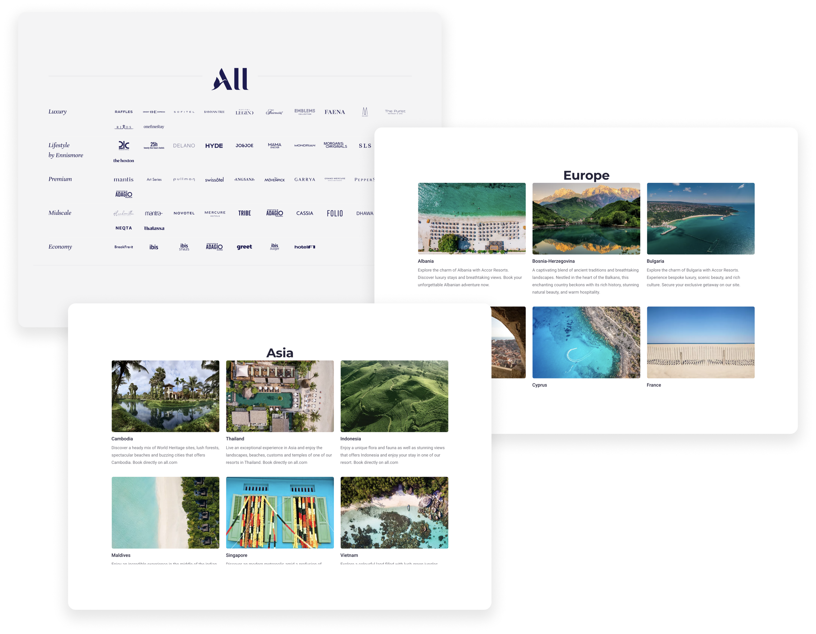
Accor is a hospitality group with over 45 brands and 5,600 hotels.

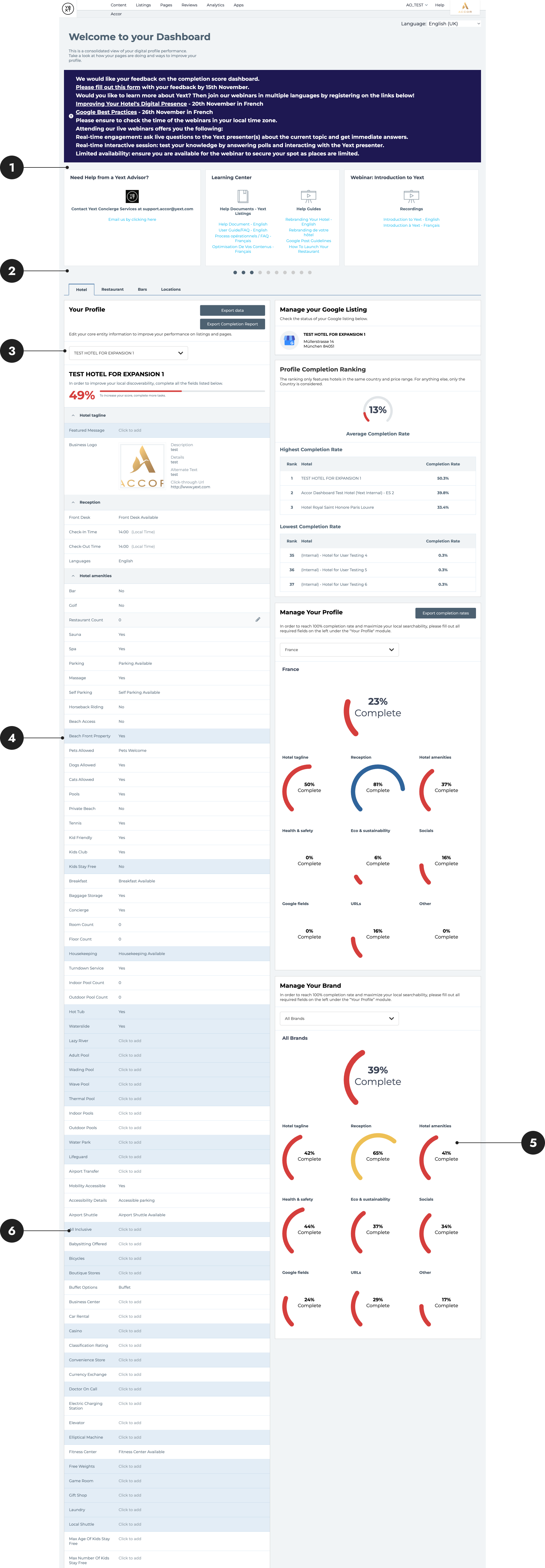
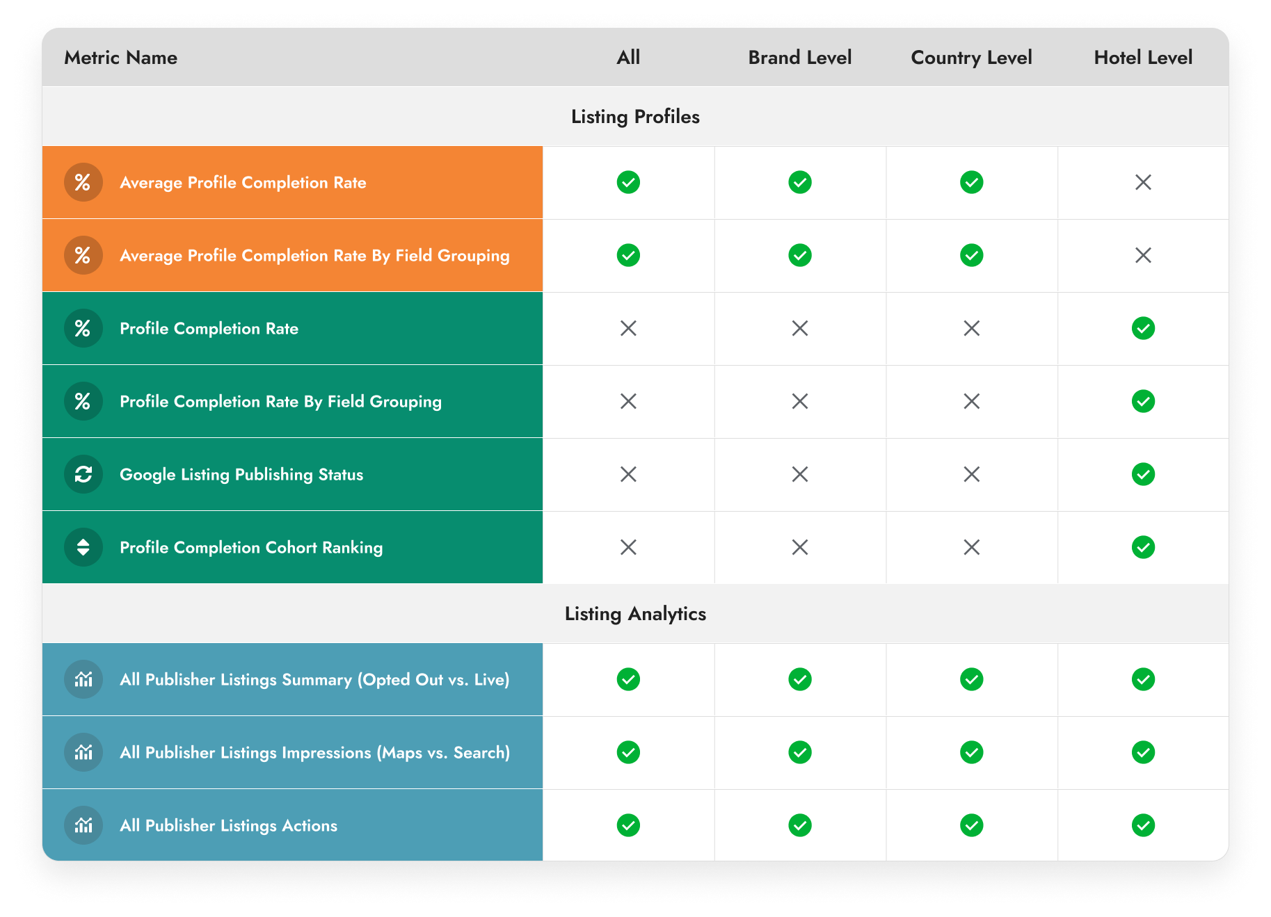
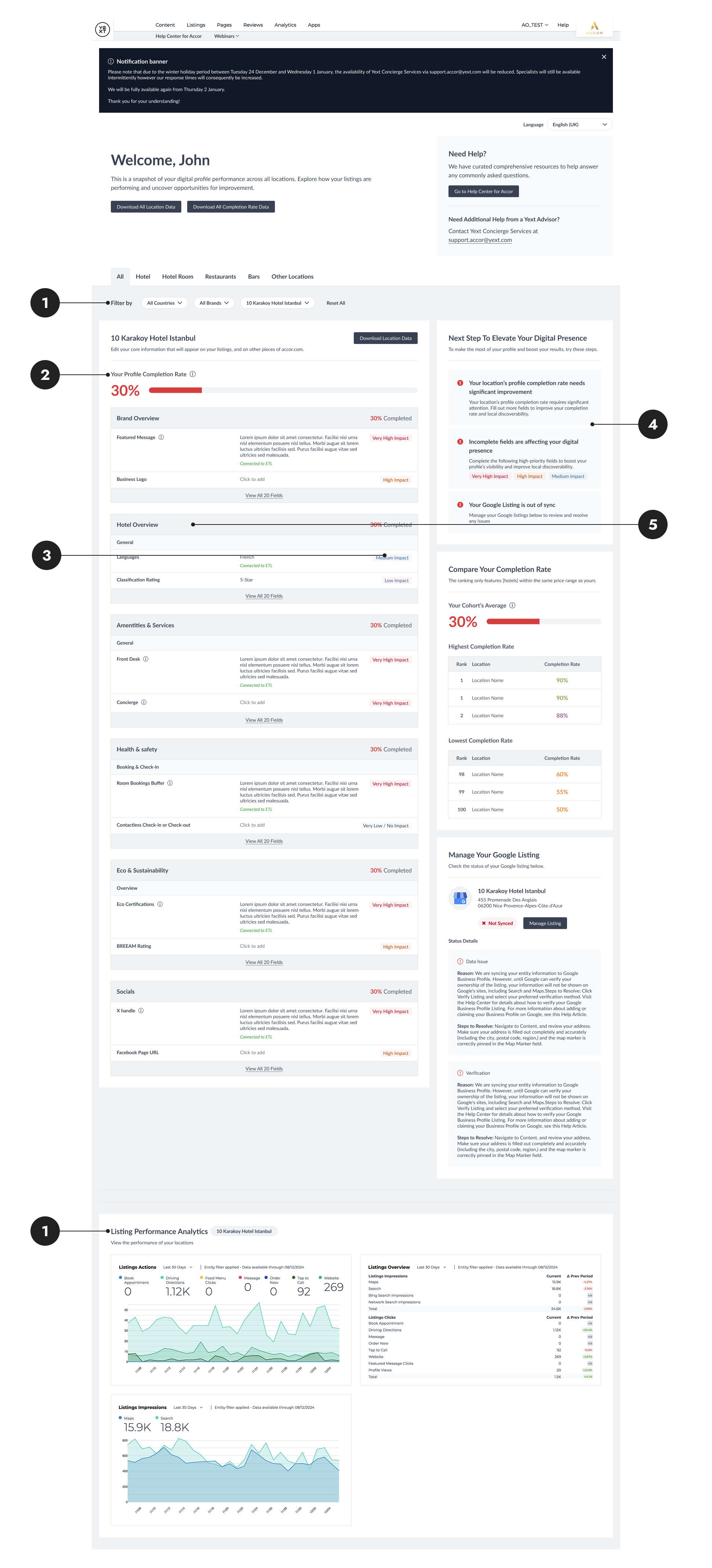
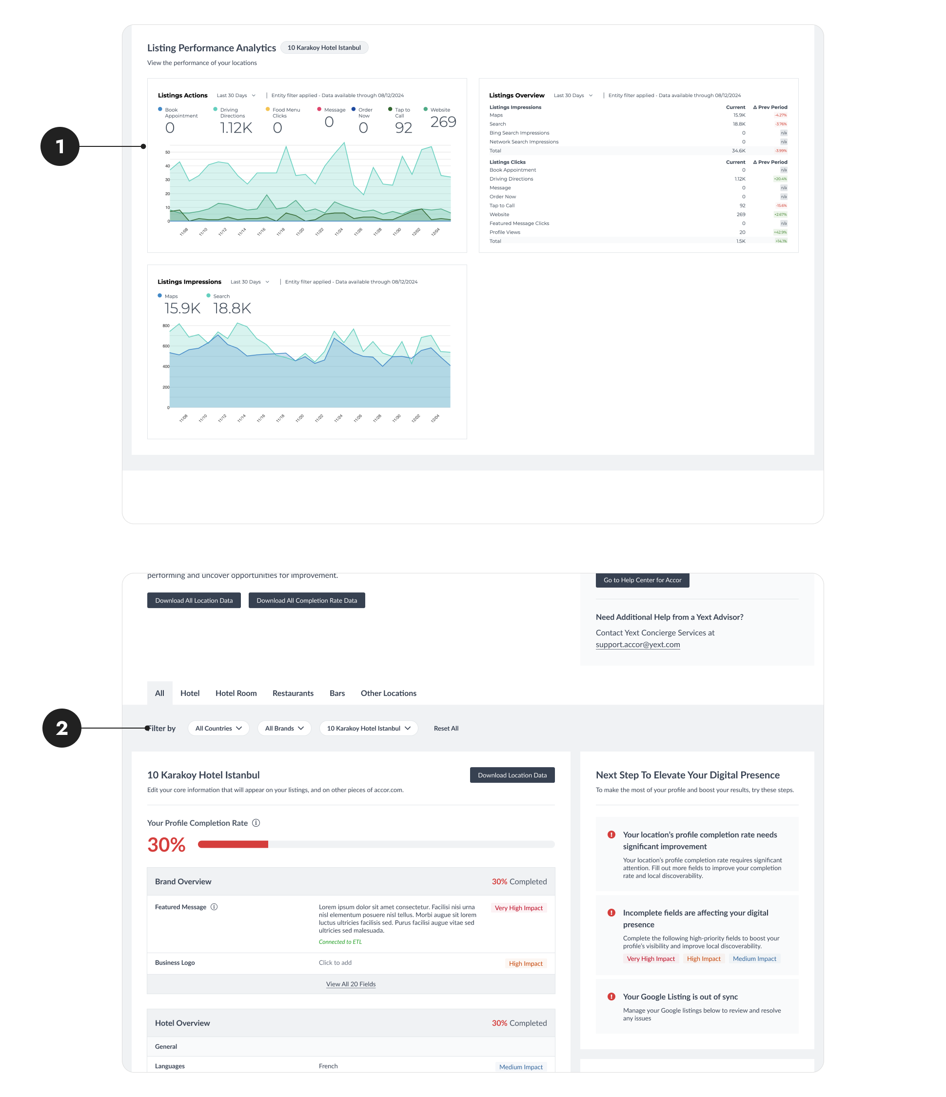
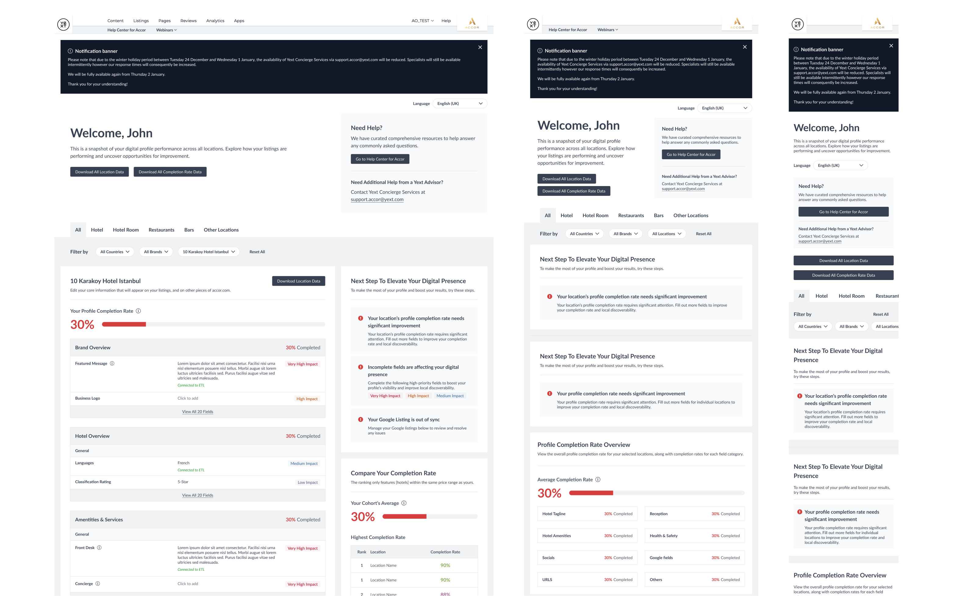
  • Accor uses Yext’s content management system to manage their hotels’ digital presence.
  • Hotel managers input hotel-specific information to their Yext-powered dashboard.
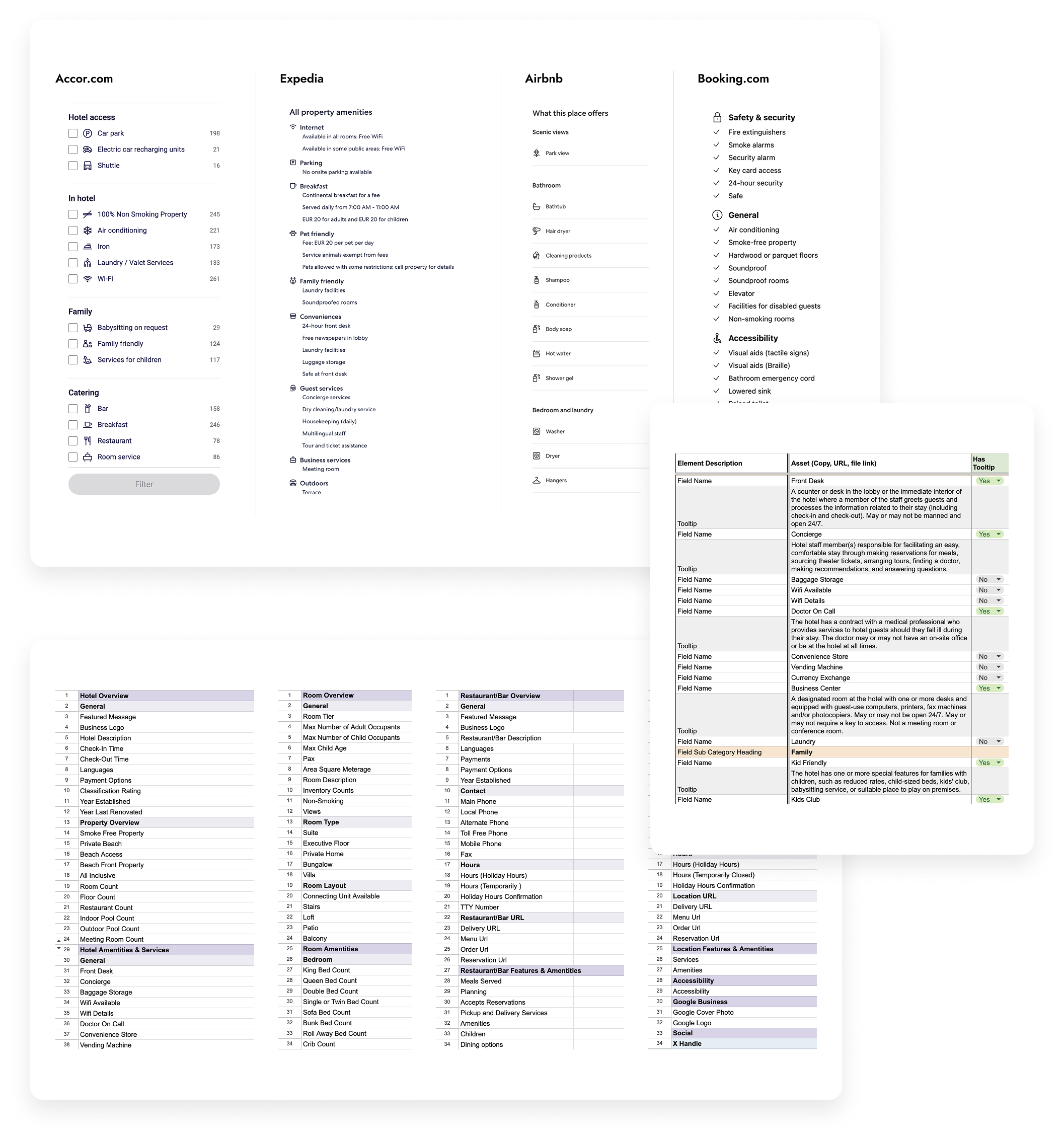
  • Next, Yext distributes the information to listing publishers such as Google, Bing, and Apple.
Image of Accor hotel business overview
Image of project goal
Overview
What was the goal?
  • The existing dashboard was built to launch quickly. The project team utilized out-of-the-box UI components without any enhancement to meet Accor’s user needs.
  • Stakeholders voiced that part of the existing dashboard isn't as intuitive as it could be.
  • With the goal of improving clarity and increasing user engagement, the project team set out to build a new dashboard.
Overview
Who are our users?
Icon of hotel manager
Hotel Managers

Users who manage individual hotels.

  • Knows all of the ins and outs of a specific hotel, including services and amenities offered.
  • Oversees the hotel restaurants and spas and want to manage the listings of these additional amenities.
Icon of regional manager
Regional Managers

Users who oversee the performance of multiple hotels that fall under the same brand or region. 

  • Prioritizes seeing aggregated performance across regions
  • Cares about the performance of individual hotels.
Research
What was the problem with existing solution?

We collected user feedback via a short survey to discover existing user pain points. I also conducted a heuristic audit with the goal of simplifying the dashboard for low-tech users. Based on the research, we discovered the following painpoints:

1
One View Doesn't Fit All

In the older dashboard, all users, regardless of responsibilities shared the same view. However, not all metrics were equally important to different types of users.

2
Cluttered Navigation

Some hotel managers, especially those less familiar with technology, found the dashboard difficult to navigate. Their feedback revealed confusion about where to look and what key actions to complete.

3
Scattered Filtering Functionality

The ability to filter the dashboard view was scattered across different modules. Each module had its own filtering dropdown (hotel vs. country vs. brand), navigating the scope of data was extremely difficult.

4
Not All Fields Are Created Equal

There are over hundreds of fields that positively impact a hotel’s ranking in search engines. A field can be as specific as whether a hotel has vending machines. Since some fields are more impactful than others (private beach vs. vending machines), users wanted to know which ones to prioritize.

5
Lacking SEO Guidance

End users were hotel experts but are not SEO experts. They wanted to know how to interpret the information and how it impacted their hotel’s performance.

6
Confusing Field Organization

The field grouping offered a high-level overview of fields. Within each category, user still needed to scan a long list of seemingly-random fields.

Image of Accor's old dashboard design
Image of Accor metrics grouping table
The Redesign: Improving Information Architecture
Restructure Metrics Grouping

For users to access the information they needed quickly, we explored alternative ways to group and filter metrics on the dashboard.

  • Through a quick logic table exercise, I was able to visualize how the types of available metrics vary across hotel, country, and brand levels.
  • I conducted whiteboarding session to explore different information architecture for displaying the data: grouping modules by different levels or by metric type.
The Redesign: Improving Information Architecture
Rework the Field Groupings

To help users scan the fields and find the desired ones more quickly, we revamped the field grouping and introduced additional sub-categories to support more granular mental models.

  • When I dove into reorganizing the listing field group, a card-sorting exercise immediately came to mind. However, to ask Hotel managers to take time out of their busy schedules and sort though hundreds of fields seemed unrealistic, so I settled on secondary research.
  • I compared Accor’s corporate domain, other large hotel chains, and Google My Business listing views to identify ways that other businesses categorized hotel amenities and services.
  • I studied field definitions to master industry terms and crosschecked grouping logic with AI for additional validation.
  • With the knowledge, I added tooltip and UX copies to help hoteliers better match each field to their hotels' amentities in the real world.
Image of Accor dashboard's fields grouping excel sheet
Image of Accor dashboard's Next Step table
The Redesign: Educating the Users
Add “Next Step” Module

To promote further actions by the hotel managers to improve hotel's digital performance, we added a net-new "Next Step" module.

  • I identified 5 distinct next steps and crafted specific UX copies to highlight and distinguish the different messagings.
  • To ensure each call-to-action is intutive and fitting into the context that it is displayed, I defined the displaying logic behind each message so they only appear in the dashboard view where the related metrics are displayed.
The Redesign: Educating the Users
Add Impact Indicators for Fields

To help users know which fields will have the most impact on their hotel performance, we developed a visual system to communicate different impact levels. We explored three concepts and ultimately chose the second option for its clear messaging, best use of colors, and conciseness.

Image of impact indicator in the style of number with text labels
1
Number with Text Labels

The option is straightforward but doesn't visually distinguish the levels from each other.

Image of impact indicator in the style of color-coded text labels
2
Color-coded Text Labels

We picked this option for its clear messaging, best use of colors, and conciseness.

Image of impact indicator in the style of dots with text labels
3
Dots with Text Labels

Dots alone don’t convey enough meaning, but adding text labels introduces visual clutter.

The Redesign: Educating the Users
Add Completion Rate Tooltips

To help hoteliers better understand how their completion rate, we added a tooltip to establish benchmarks for hotel managers.

  • Color indicators were used for different completion rate ranges to convey urgency.
  • The tooltip is embeded alongside every occurrence of the completion rate metric to educate users at every opportunity.
Image of Accor's completion rate design
Image of Accor dashboard's redesign
The Redesign
The Final Product
1
Enhanced Metrics Groupings

There are dedicated modules for each distinct type of metric. Filters are consolidated at the top of the dashboard. Users can customize their dashboard view using the filters based on their role and goals all at once.

2
Educational Tooltips

Carefully crafted tooltips are seen throughout the dashboard to help educate users on what they are looking at and why it is important for them.

3
Actionable Next Steps

Next-step suggestions are provided to guide the users towards impactful actions and improve hotels' online presence.

4
Digestiable Field Groupings

Fields are reorganized and meticulously grouped into sub-categories to help users find the field are looking for more quickly.

5
Informative Impact Indicators

The impact level of each field on their digital performance is added. The color-coded labels help users prioritize which fields to complete.

Positive Feedback
The Impact

The initial phase of the project is complete, with positive feedback from end users highlighting its value.

Putting aggregated data in one place is a very good idea and make it much more readable.

— Laurance

Being able to filter by countries and brand is very useful. It would be great to filter by city as well.

— Maamar

Next Steps
Future Enhancement

Among the feedback, however, we also recieved request to further enhance the dashboard. These feedback will be addressed in the upcoming product iteractions.

1
Enhancing Analytic Modules

User feedback revealed that they want to understand the data in the analytic modules, interpret visualizations, and know what actions to take next. Users also expressed interest in seeing more dynamic data and being able to compare changes across longer time periods.

2
Other Ideas to Improve Filters

With the improved filtering experience, users are now requesting even more flexibility, such as the ability to manually select a custom subset of hotels to view aggregated performance.

Image of Accor project's next step
Figma Tool for Content and Metadata Annotations & Extraction